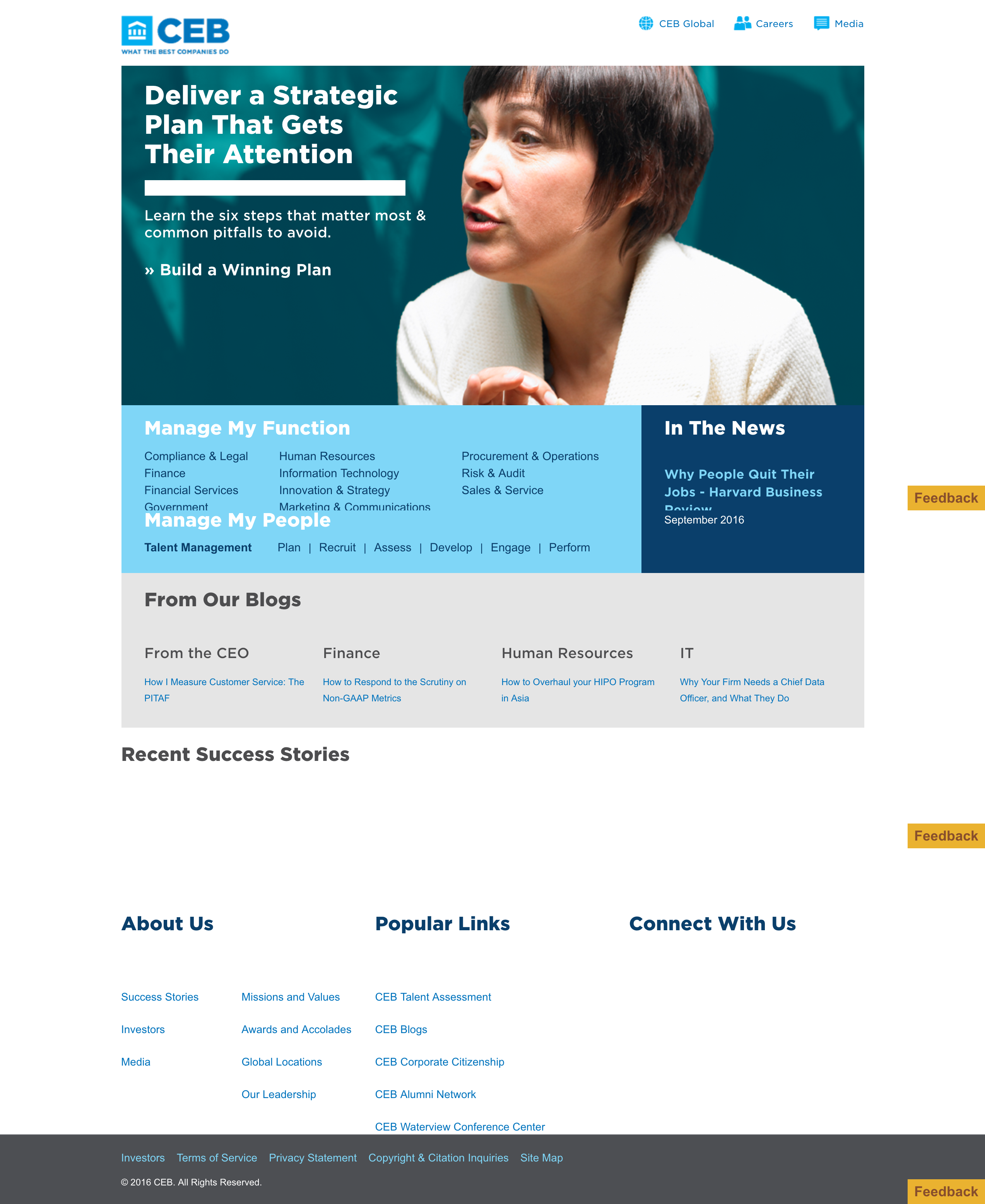
CEB's homepage before our work, August 2016
We learned in our six week Discovery phase that internal change management would be one of our highest barriers. We conducted brand surveys, stakeholder interviews, a content audit, a competitive landscape, and SEO and analytics reviews for our body of research, from which to form our goals:
-To modernize the digital brand aesthetic
-To unify the internal stakeholders and varying design team workflows
-To adapt the content structure to a more longterm digital strategy based around intuitive, user-focused subjects and topic centers
-To bring cohesion across the many CEB product experiences
We efficiently mitigated the constraints of building one skin on multiple sites and personas by building modularly, creating a module library that would maximize simplicity across all user journeys.
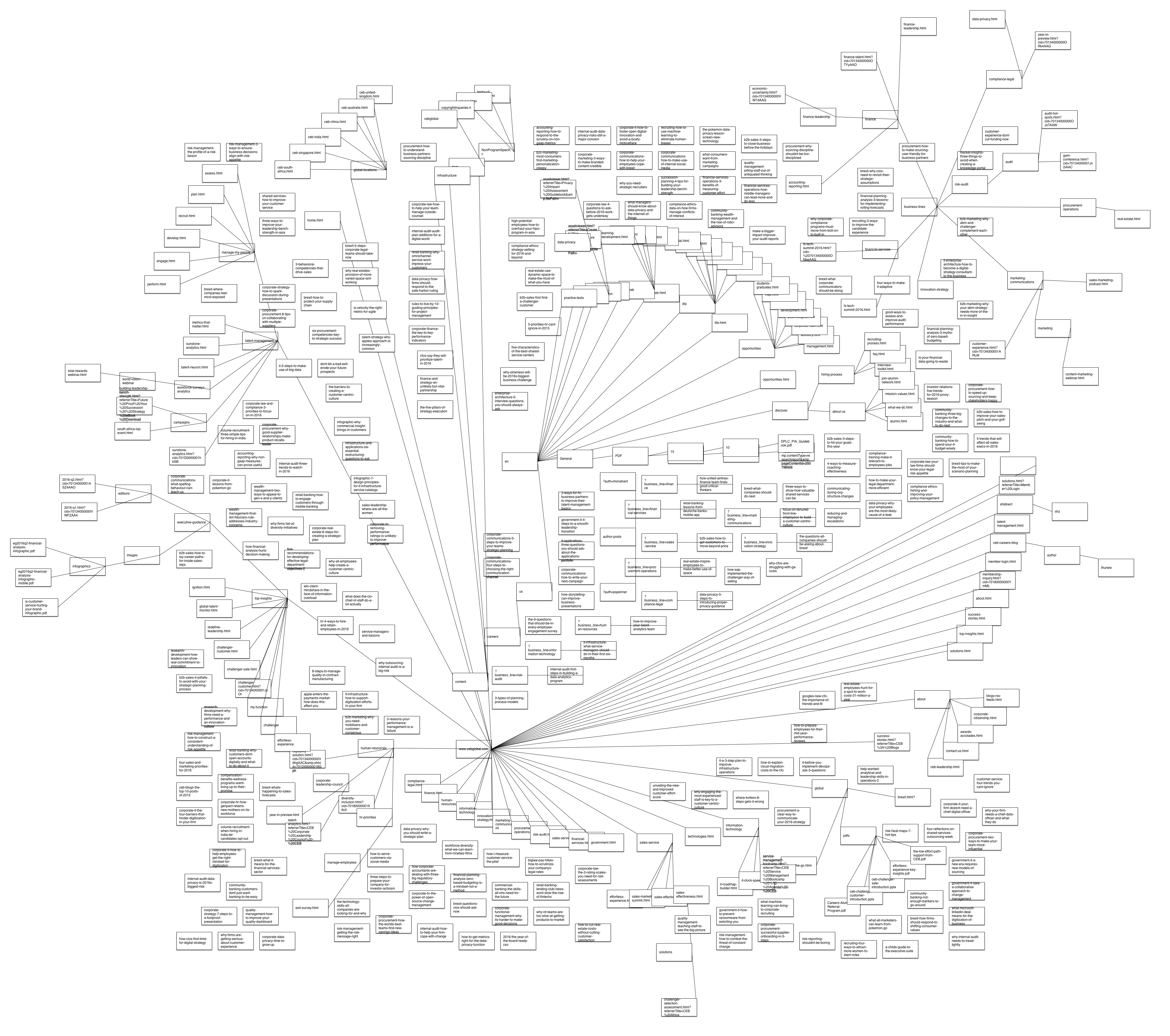
We first contextualized their existing information architecture. We created a visualization of all the current user paths and page structures within the existing taxonomy:
Pre-Redesign Site Content Audit Mapping
From there, I created a Site Flow Diagram, which served as a guidepost for all editorial decisions in the redesign.
Site Flow Diagram
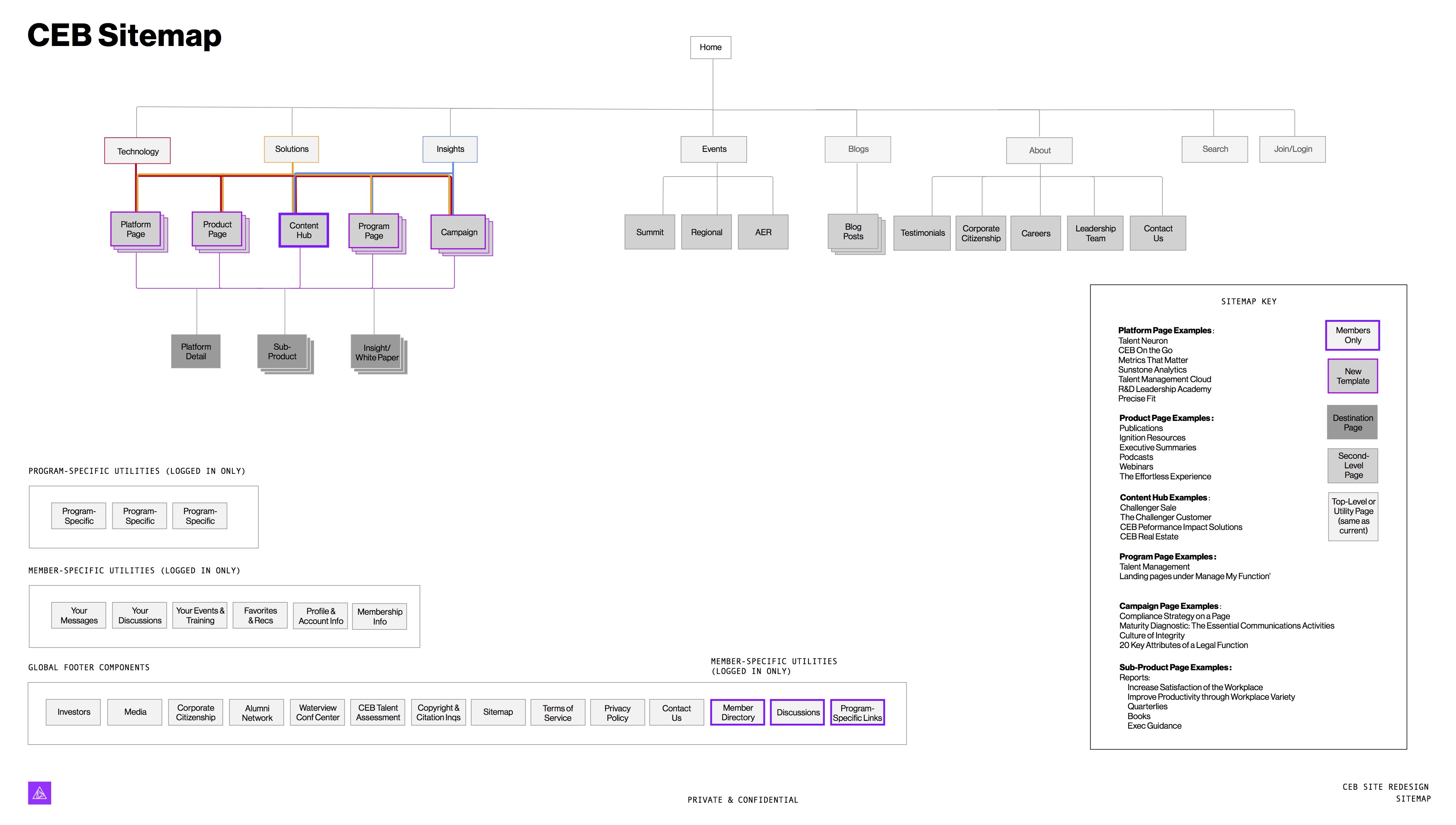
The goals of this diagram were:
-To unify the existing information architectures across all the many CEB content and design teams while providing a high-level roadmap for the longterm content strategy
-To create a new content "hub" taxonomy, in which content would align in an intuitive user flow by category of user need, by subject area.
-To preserve the work of the many internal design teams while creating a structure for forward-thinking sustainability
With a new plan of action for information architecture and user flows in place, my team began the wireframing process, building modularly using a 12-column grid system to ensure flexibility. I led design for 21 screens using 70+ modules for this initiative.
Wireframe Examples
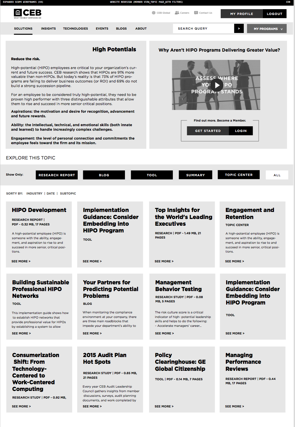

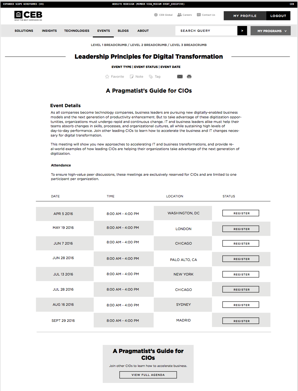
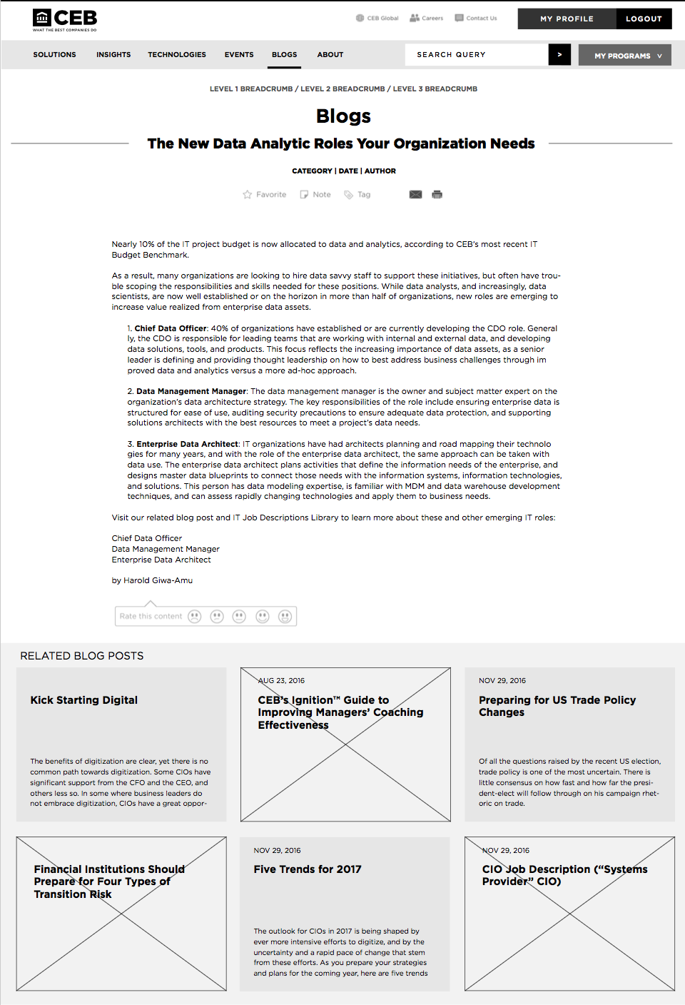

The goals of these wireframes were:
-To create a finite, modular design system for all CEB design teams to use across their product suite
-To unify the product suite with cohesive calls to action and task achievement
-To establish a longterm, sustainable digital workflow for all CEB teams using one visual language.
After the wireframes were approved, we began designing the final product in-browser, creating a standalone module library for reference.
Our solution: CEB's new module library
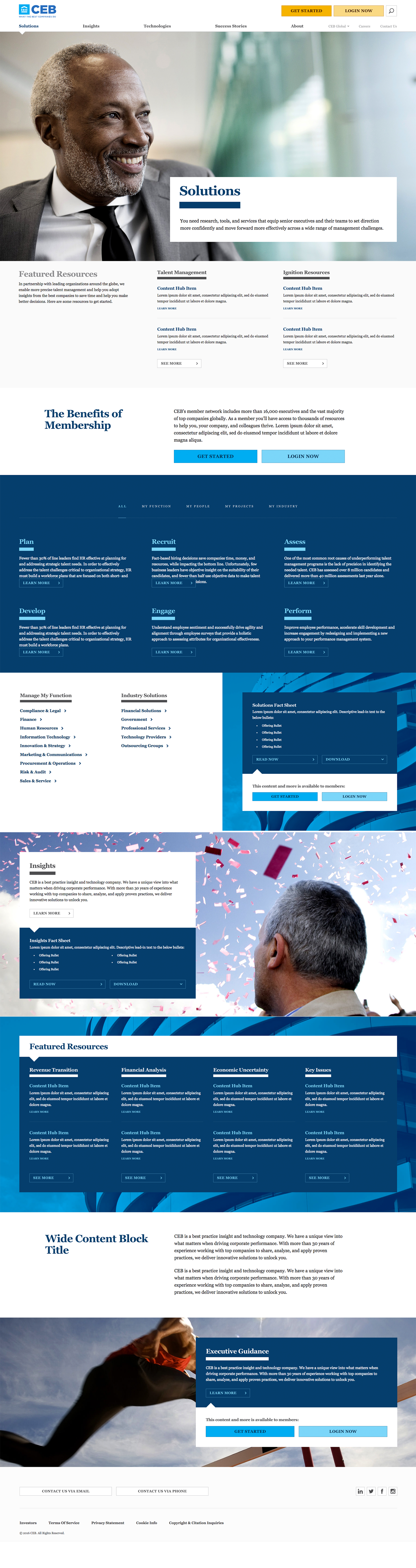
The goals of the site aesthetic were:
-To leverage the already established CEB brand voice and tone using their logos, typography, and color scheme
-To bridge the gap between the CEB print aesthetic and the digital space using an adaptable column grid
-To create a visual hierarchy using dramatic typography and imagery for hero modules with a clean, utilitarian UI
The project was completed in January 2017, at the time of CEB's announcement that it was acquired by Gartner research. As a result of the acquisition, the modular components of this design are strategically being implemented across Gartner's many CEB platforms as their many development teams merge.
To see how these modules are being gradually implemented by the CEB/Gartner development teams, check out their site.
Copyright 2018, Chloe Negron